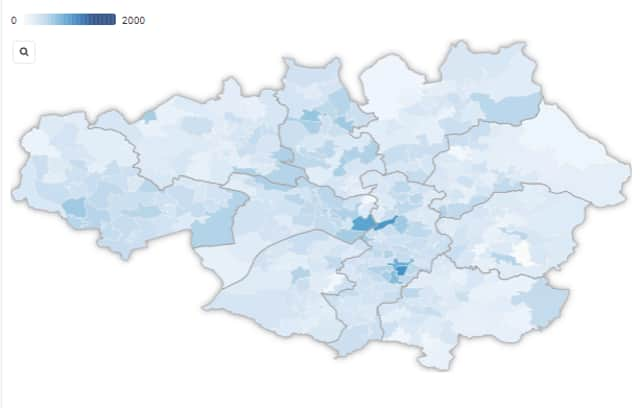
Interactive video shows how Covid spread through Manchester’s neighbourhoods during 2021


Coronavirus infections surged across England during the summer months, with the race on to vaccinate enough people to counteract the increase in socialisation as we emerged from long months of lockdown.
But how have cases fared where you live in Manchester compared to neighbouring areas?
Advertisement
Hide AdAdvertisement
Hide AdManchesterWorld has created an interactive map showing the spread and ebb of coronavirus throughout the greater city area during 2021.
Darker areas show higher number of cases by neighbourhood, revealing spikes in cases throughout June and July as the economy reopened.
The data is based on confirmed cases per 100,000 people in rolling seven-day periods, based on the date of test. People are only counted once in the data, with duplicate positives excluded.
The neighbourhoods are Middle Super Layer Output areas – small geographic units containing roughly 7,000 people each. When there were only between 0 and two cases during the week, the figures are suppressed to protect anonymity, and the area appears white.
Where has the highest number of cases?
Advertisement
Hide AdAdvertisement
Hide AdThe figures, taken from the UK Government dashboard, show the highest rate of cases recorded so far in 2021 was in the Lever Edge area in the week to 20 May, with 1,952 cases per 100,000 residents.
The latest data, which covers the seven days to 5 August, shows New Islington and Miles Platting has the highest rate (838) followed by City Centre North and Collyhurst (775) and Ordsall and Salford Quays (762).
Loading....
How accurate is the data?
Government Covid data uses the latest mid-year population estimates from the Office for National Statistics (ONS) to work out rates per 100,000 people.
The ONS uses university students’ term time residences when estimating the number of people who live in an area.
Advertisement
Hide AdAdvertisement
Hide AdManchester, as a university city, could therefore have misleading case rates in areas heavily populated by students, as the positive cases outside of term time may actually be among a much smaller population than is represented in the data.
That is because if an area has 100 cases among a population of 7,000 people, its rate would be 1,429 per 100.000 people – but if 2,000 of those residents are students who are not living in the area during the holidays, the true rate would be 2,000 cases per 100,000.
What is the situation now in Manchester?
Of Manchester’s 346 neighbourhoods, 190 (55%) saw a drop in cases in the seven days to 5 August compared to the week to 29 July.
The borough with the highest seven-day case rate at the latest count was Salford, with 389 cases per 100,000 people. That was followed by Oldham (346) and Manchester (344).
Advertisement
Hide AdAdvertisement
Hide AdThe area with the lowest infections was Bolton, with 200 per 100,000.
Currently, vaccine uptake for first doses ranges from 64% in Manchester to 84.8% in Stockport. Manchester is the only borough with uptake lower than 70%. The UK average is 89.1%.
You can see a larger version of the map here.
widthwidthheightheight
Comment Guidelines
National World encourages reader discussion on our stories. User feedback, insights and back-and-forth exchanges add a rich layer of context to reporting. Please review our Community Guidelines before commenting.
